TFA Hub

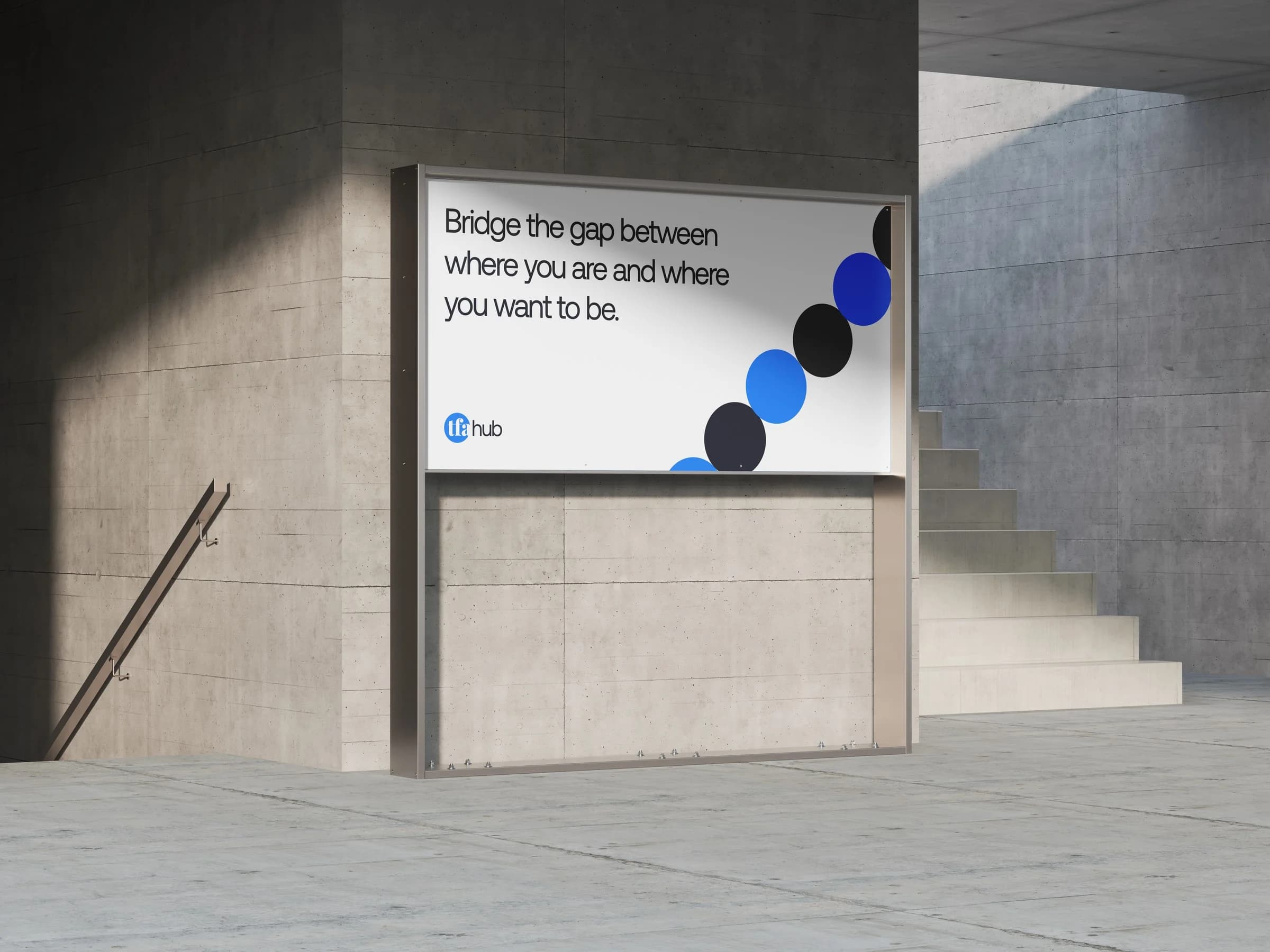
A coaching hub bridging where careers are and where they could be
- Client
- TFA Hub
- Year
- 2024
- Services
- Brand Identity
- Logo Design
- Typography
- Colour System
- Brand Applications








Project information
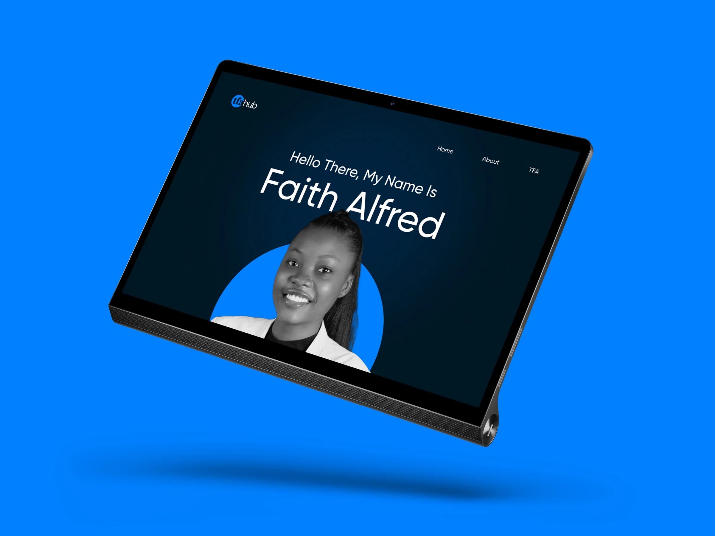
TFA Hub is a transformational coaching hub founded by Faith Alfred for career-driven people looking for clarity, growth and direction. It is the bridge between where they are now and where they want to be, with the structure, guidance and support to make that move.
The identity had to feel warm and confident at once: credible enough for ambitious professionals, and human enough to speak to people at a turning point in their careers.
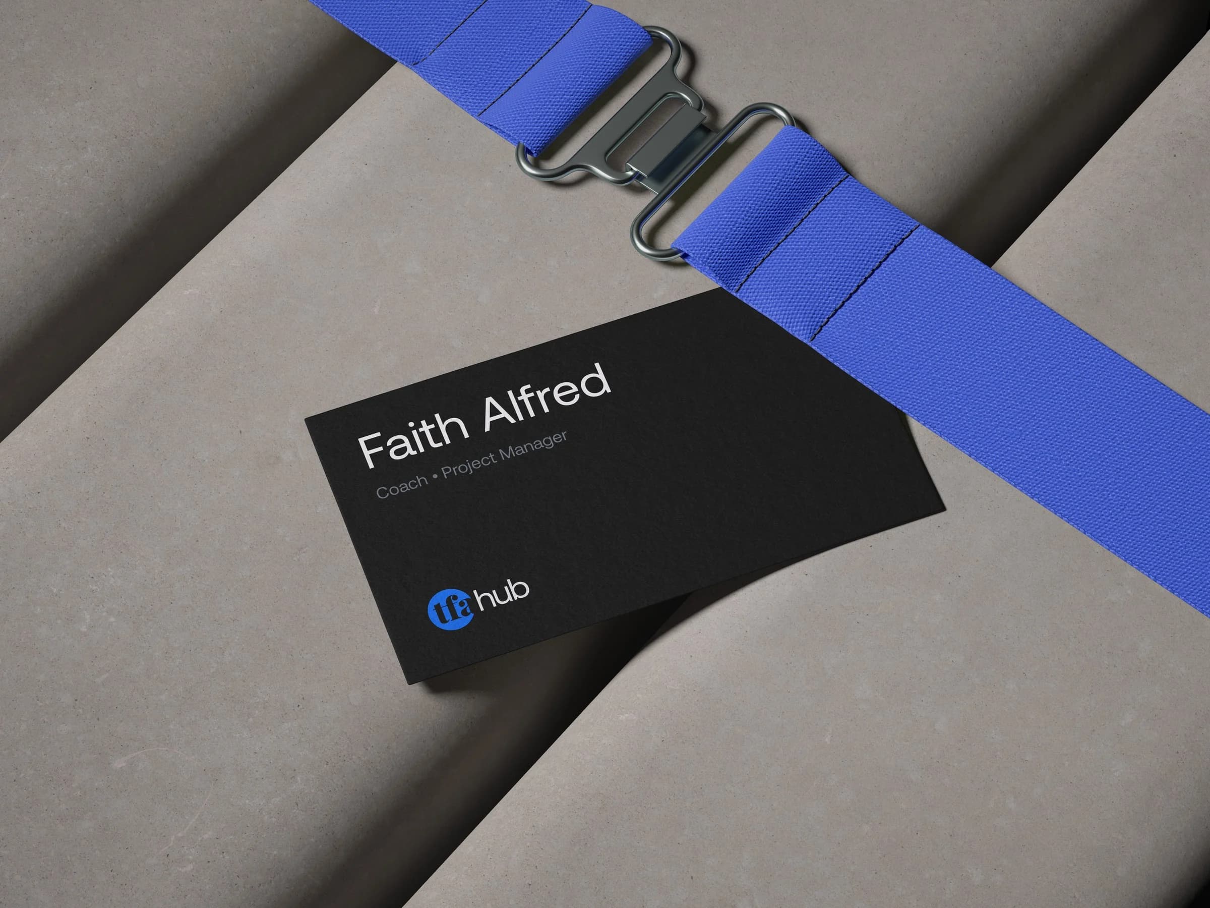
The mark is built on a circle, a sign of community and a network brought together under one name. Inside it, the initials TFA are formed from negative space, revealing hidden potential and acting as a gateway, the bridge the hub exists to provide. The A breaks out beyond the circle, an invitation to step forward.
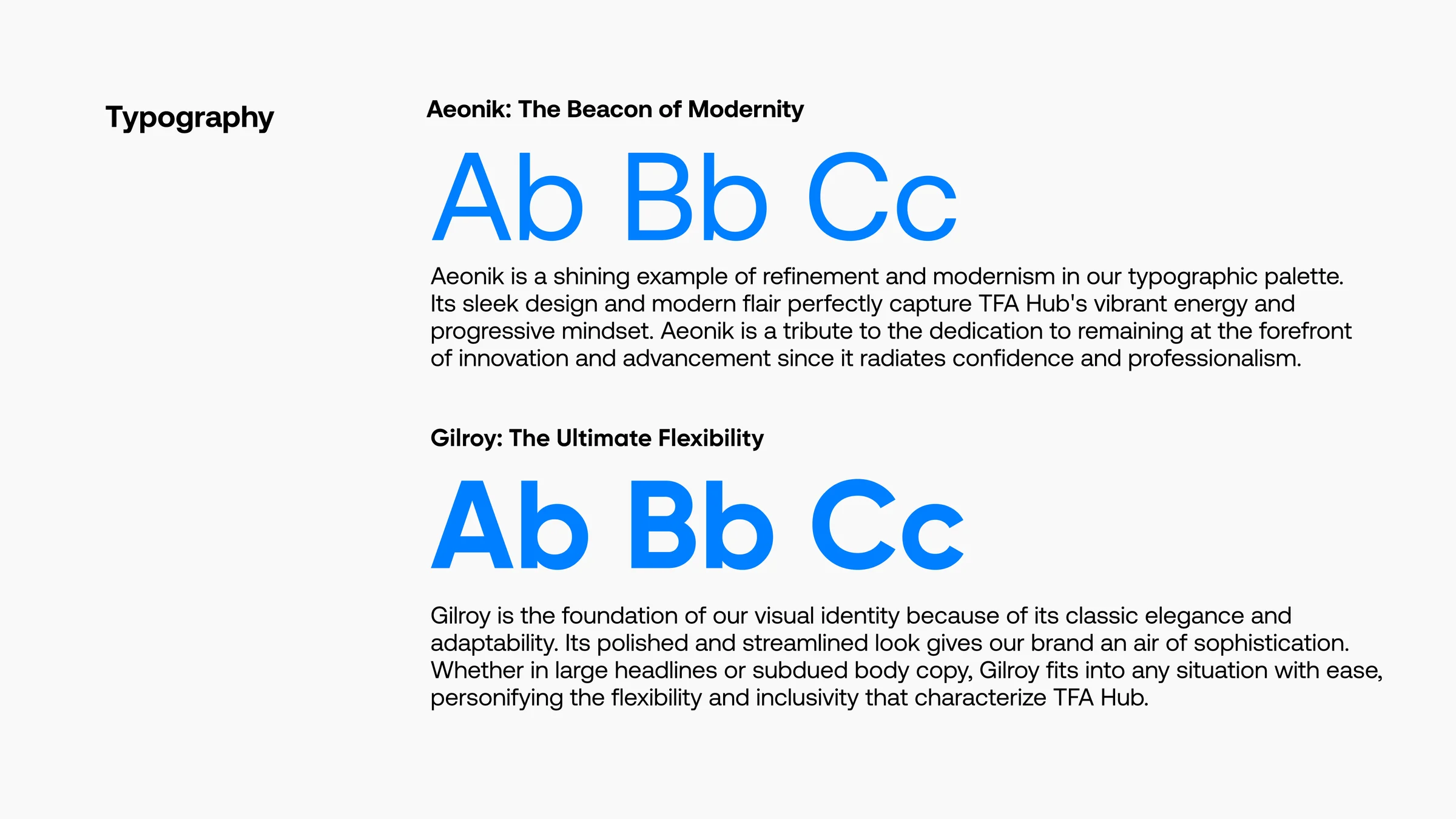
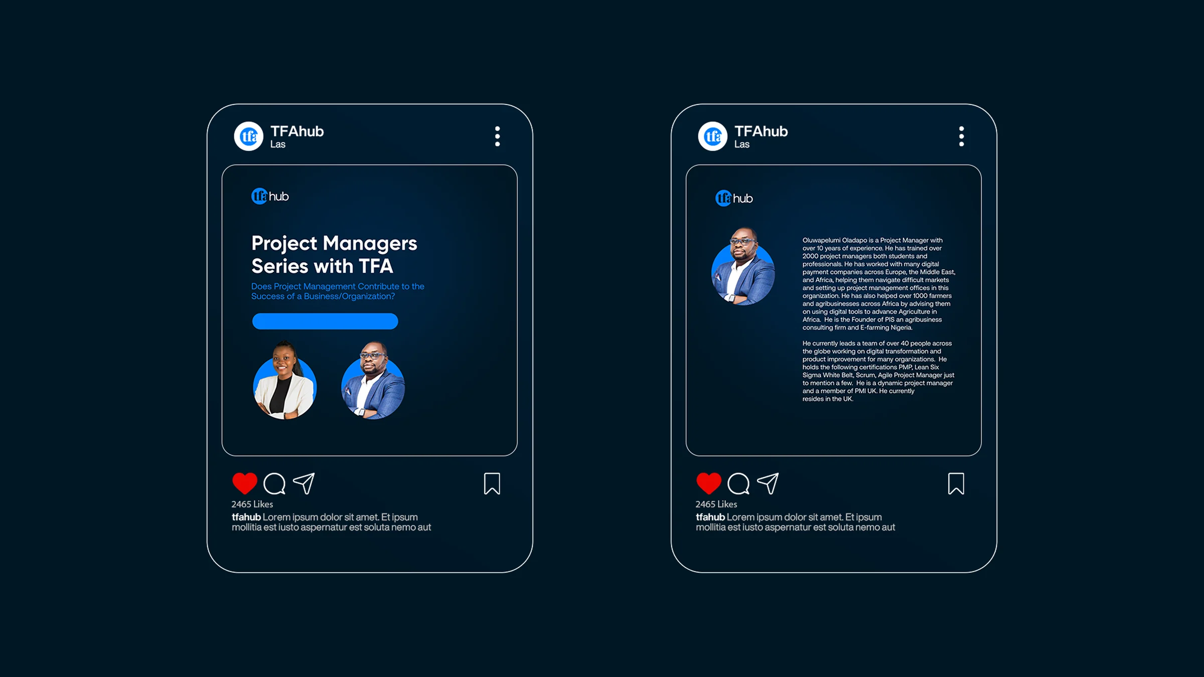
TFA is set in Playfair for a note of classic sophistication, and HUB in Aeonik for something more modern: heritage and progress side by side. Across the wider system, Aeonik and Gilroy carry the brand from headlines to the smallest line of copy.
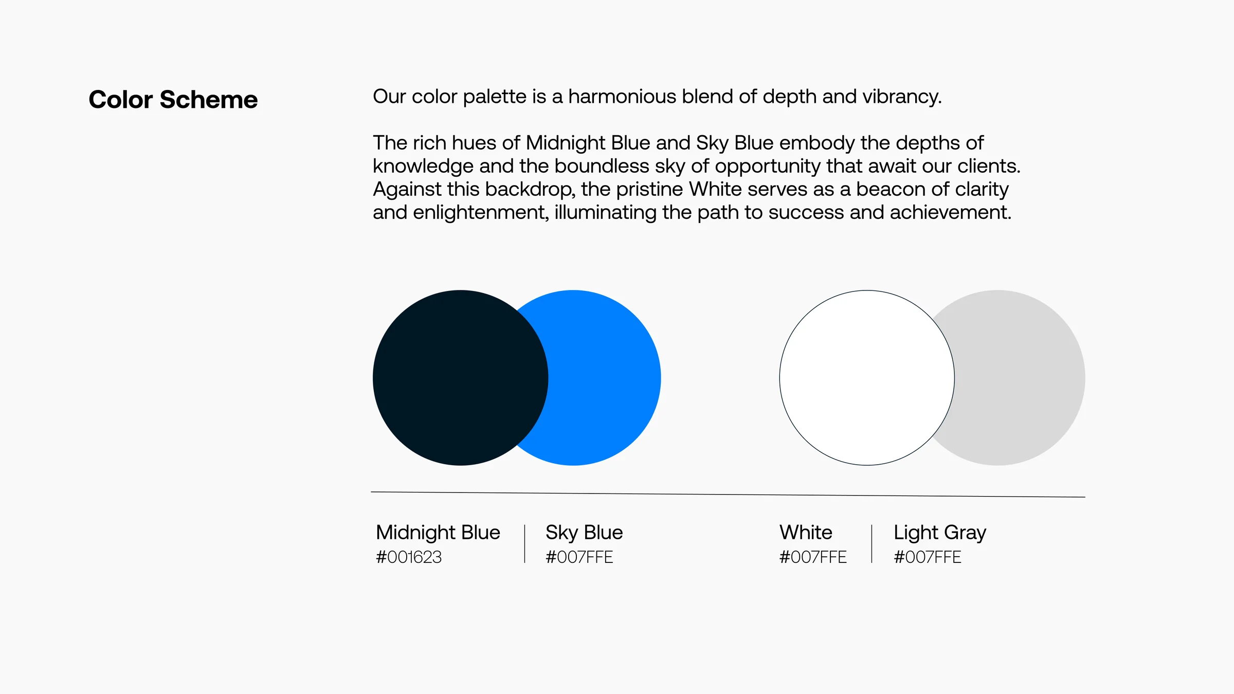
Colour follows the same idea. Midnight Blue holds the depth of knowledge, Sky Blue the open sky of opportunity, and White brings clarity to everything in between.
In the end, TFA Hub became more than a coaching platform. It is a growth partner: a place where potential meets direction, and where people find the tools, mindset and strategy to close the gap between where they are and where they want to be.
Credits
Tor Studio
- Creative Director:
- Victor Alfred